Analytics Boot Camp, Day 4: Behavior
Hello, Boot Campers!
Welcome to Day Four of our Google Analytics Boot Camp. Are your eyes bleeding yet? Are you dreaming of pie graphs and metrics? We are.
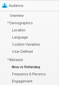 Today, we’re covering the Behavior area, which is in our Standard Reporting tab on the Admin Dashboard within Google Analytics (GA.)
We’ll find it under Audience -> Behavior. Clicking on the Behavior menu, we see a drop-down, which includes:
* New vs Returning
* Frequency & Recency
* Engagement
We think there should also be sections for “coming when called,” “not peeing on the rugs,” and “going home at a polite hour,” but that’s just us.
The “New vs Returning” area is exactly what you’d expect it to be – information as to whether our visitors have been to our site recently. We’ve covered this territory previously, so let’s leap right into Frequency & Recency.
Frequency & Recency
From Google’s own definition: “This report provides statistics about the number of visits and pageviews, how frequently visitors return, and how recently (in days) those visits have occurred.”
We don’t know about you, but our eyes glazed over before we even reached the end of the sentence. Come on, Google; give us useful information even idiots like us can understand! Ok, ok; you can probably tell we’re tired of deciphering bad documentation – we’ll quit whining.
The Frequency and Recency report lets us see how many times people are returning to visit our site within a given time frame, and how much time goes by between visits. These statistics are calculated once per unique visitor, and cannot account for the same person logged into different computers on different IP addresses, et cetera.
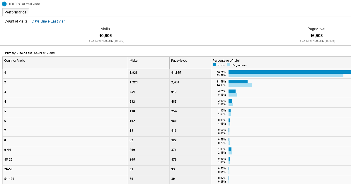
For the purposes for this tutorial, we’re using a website that’s Not Black Chicken Host to better demonstrate our points. Let’s look at the histogram (click to view at a larger size in a new window or tab: )
You can see the overwhelming majority of visitors (74.75%) visited the site once and never came back during the time period we selected for. Bummer! This means they either didn’t like what they saw, or it didn’t make enough of an impact to bring them back. That’s a discouraging metric for a web author, and may indicate some changes are warranted to encourage repeat visits and engagement.
Also in this histogram is a breakdown of Visits and Pageviews for comparison. If the Pageviews bar is longer than the Visits bar, people are surfing around the site.
11.53% of visitors came twice, and the numbers go down from there. Heart-breaking! Most of us want repeat visitors.
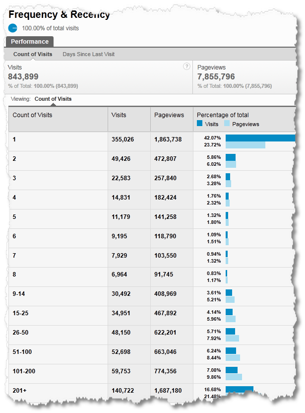
We’re borrowing an example of a bottom-weighted graphic from Kaushik.net to show you what that looks like (the funky edges are theirs not ours: )
In this example, you can see many viewers (42.07%) still only came once, but that they have a loyal repeat visitor base (43%) who came back between 9 and over 200 times – not bad! A high rate of repeat visitors means people either like what they see, or want something you have.
We can also look at Recency, which we find by clicking on the Days Since Last Visit link.
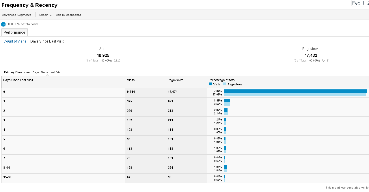
This will show us the number of days (0 – 30) which lapsed between visitor returns. If a unique visitor came back to your site less than 24 hours since his or her last visit, that visitor will register as “0 days since last visit.” Let’s look at our first example, the one with a low return rate:
Of the return visitors, most (87.34%) came back in less than one day! This would seem to indicate even though the return visitor percentage is not high, those who do return are really interested in the site! That’s great news! This web author just needs to figure out how to hook more of those first-time viewers to convert them into loyal readers.
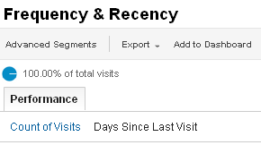
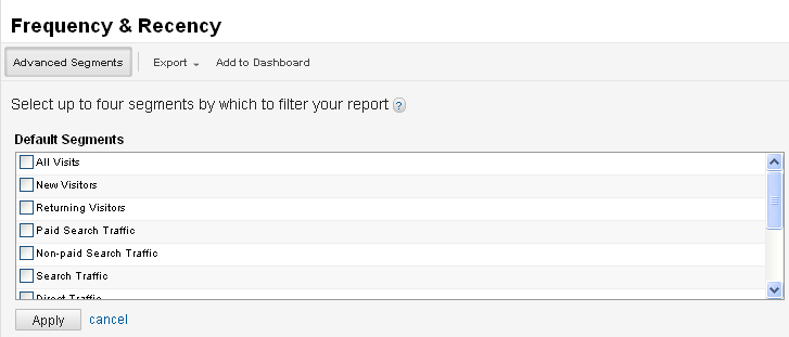
We can filter these reports (Count of Visits and Days Since Last Visit) using the Advanced Segments filter, which is located at the top left.
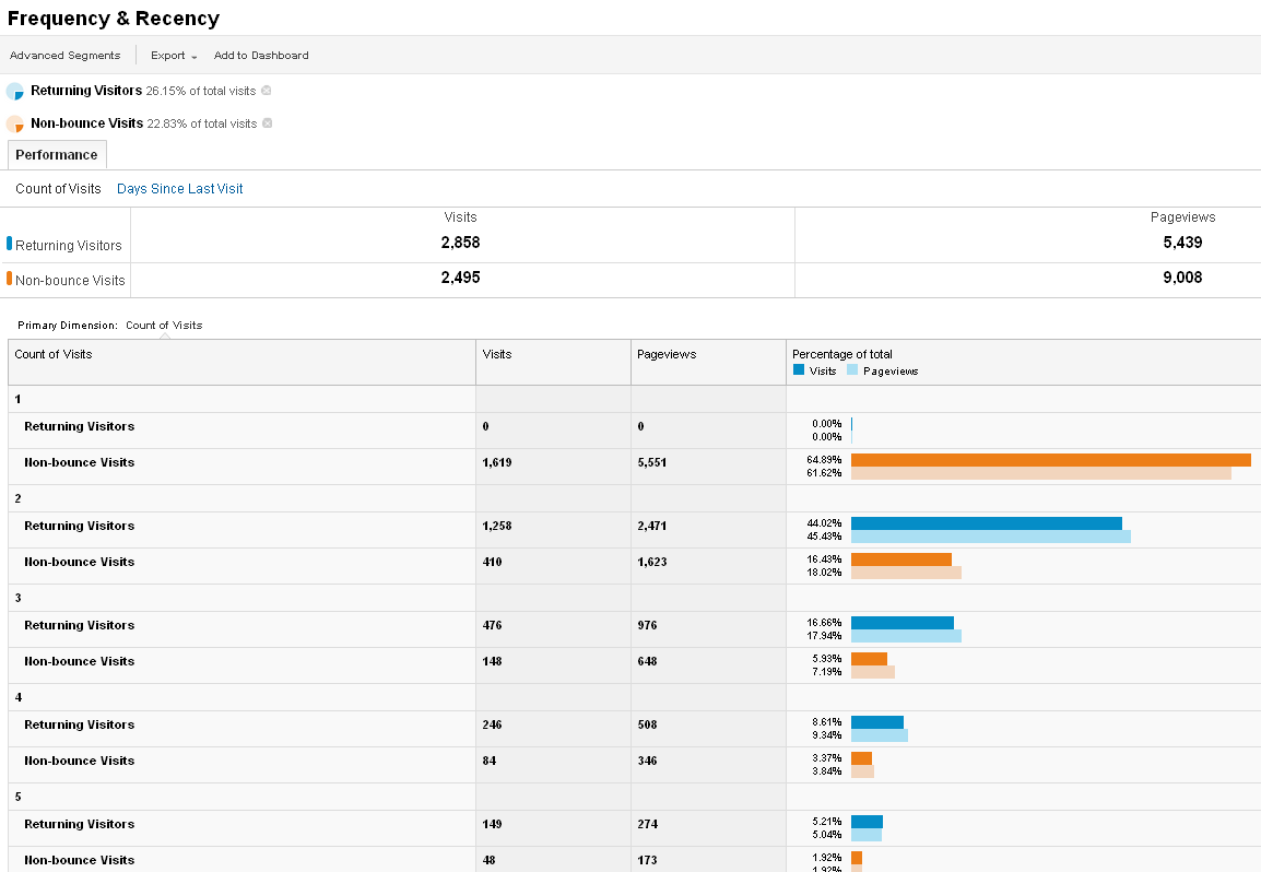
We can choose up to four of these segments to customize the report. Let’s select Returning Visitors with Non-bounce Visits.
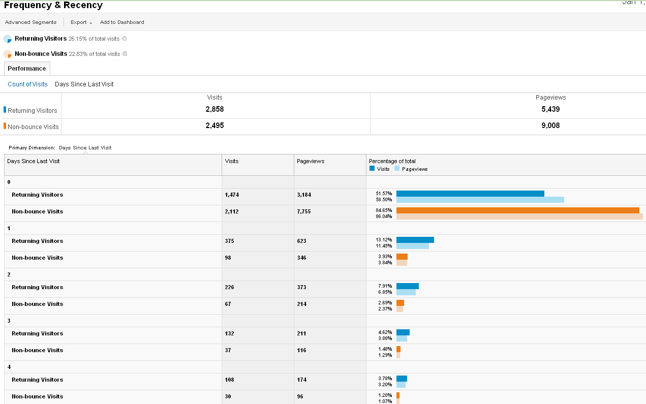
We can see the filtered information broken down by Count of Visits in this view. In the Days Since Last Visit view, we see the following:
We can compare and contrast our advanced segments to drill down through the information and try to make sense of what information we’re after. Try Returning Visitors with All Visits. Mix and match for metric fun.
Moving along!
Engagement
Are your readers ready to take your relationship to the next level? Ok, maybe that’s not what this metric covers. “Engagment” is all about how much your readers interact with your site. From the horse’s mouth: “This report provides statistics about the number of visits and pageviews, how much time (in seconds) visitors spent on your site, and how many pages they viewed per visit. Click Visit Duration to see visits and pageviews distributed by the number of seconds visitors spent on your site during each visit. Click Page Depth to see visits and pageviews distributed by the number of pages viewed during a visit.”
We’ve touched on this previously – remember those few readers who spent 1801+ seconds on our site, and how we wanted to reach out and hug them? This is a return to that information.
What’s new, though, is the Page Depth link.
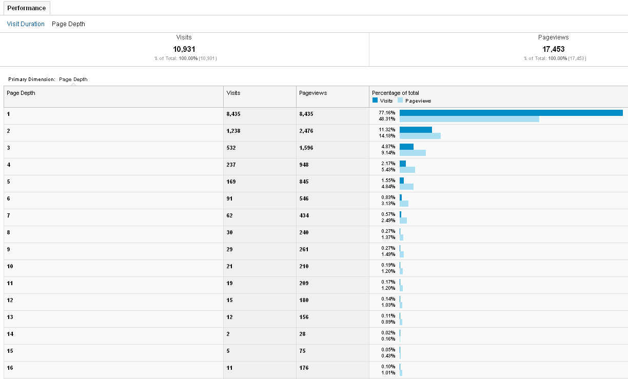
This view shows us how many pages each visitor clicked on during a single visit.
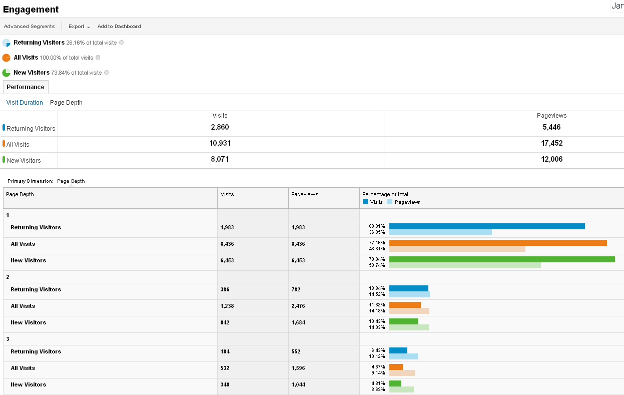
From this histogram, we can see 77.16% of all visits involved only one pageview. As previously discussed, this may be due to regular visitors only reading the most recent post, or it may be due to first-time visitors feeling underwhelmed by the site. Let’s add some Advanced Segments – Returning Visitors, All Visits, and New Visitors:
From this, we can discern there are a fair number of return visitors who are viewing only one page. However, 79.94% of new visitors are only viewing one page, too, which might indicate a lack of interest.
At the bottom of the report, the 20+ pages viewed metric, we do see some new and returning visitors, which is heartening:

We can mix and match Advanced Segments as we desire to obtain the information we need.
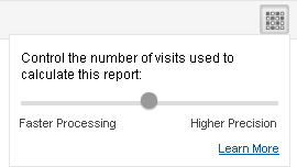
There’s one other item to note on these reports appearing in the top right corner:
The default is smack-dab in the middle, balancing faster processing with higher precision. Clicking the “Learn More” link will land us on this page, which explains the difference. For site which are not exceptionally busy, Higher Precision will offer (oddly enough) more precise data without bogging the statistics process down overly-much.
Keeping your attention span happy since… well, just earlier this week.
That’s all for now! In the next Boot Camp, we’ll cover the Technology, Social, and Mobile areas of the Audience section. In the Camp after that, we’ll look at a super-keen section, Visitors Flow.
As always, thanks for reading, and please feel free to ask for clarification or add further information.

