Analytics Boot Camp Day 4: Technology
 Howdy, Boot Camp Attendees –
Get this – we’re almost halfway through the Standard Reporting tab! Soon, you’ll be a total pro at Google Analytics (GA.)
Tonight’s installment covers the Technology, Social, and Mobile menus, which we find under Standard Reporting, Audience.
Technology
The first item under Technology is Browser & OS. This gives us basic demographic information about what web browser and operating systems our visitors are using. Why do we care?
We may care because our websites look different when viewed via each browser/OS – albeit, some sites may look only slightly different. If most of our visitors are using one particular browser, we may wish to tailor the site so it looks best using that technology.
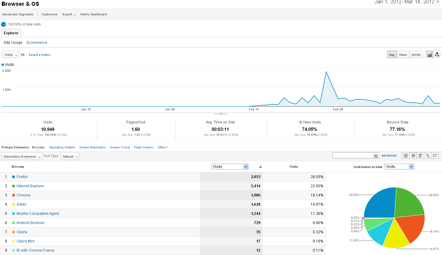
The Browser & OS report for our example site follows (click to view larger: )
The top line graph is our standard default Visits view. The bottom part is where we begin to see new, pretty things:
Did you know websites gather this information about your computer when you browse them? Indeed, many do.
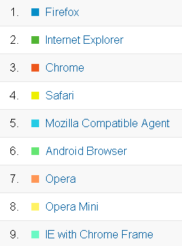
Let’s leave the Primary Dimension set to Browser for now. We can see the majority of our visitors are using Firefox, followed by Internet Explorer, followed by Chrome. We’re not going to get into the holy war over browsers and operating systems – remember, we’re just showing you information.
Some of you have likely never heard of Opera, or perhaps of Android. Android is Google’s operating system, which is Linux-based and primarily for mobile devices, such as cell phones and tablets. Opera is an underdog browser with a small but loyal following.
Firefox, IE, and Chrome are the big players these days, so most web designers will test their sites’ appearance in these three browsers. There are more Windows users than Macs, but it’s important to consider Mac readers when designing a site, as their numbers are significant.
For websites which are often accessed via a mobile device, it’s important to ensure the site looks good on smaller screens and under mobile browsers and operating systems.
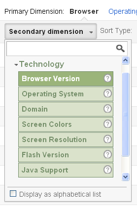
We can add a Secondary Dimension to this chart by clicking the Secondary dimension dropdown. The Secondary Dimension can be non-technology in nature. Since we’re talking Tech in this camp, however, we’re going to stick to that sub-category.
You can overlay any of the options, including what domain the user is accessing from (which will usually be their local Internet Service Provider (ISP,) Browser Version (the software version of the browser,) Screen colors (how many colors their screen is able to display, usually 16-, 24-, or 32-bit – the higher the number, the more colors are displayed,) Screen resolution (the higher the number, the more information is displayed on the screen,) Flash version (important for websites using and updating Flash,) and whether Java is enabled (many websites rely upon Javascript for additional functionality; however, it can be a security concern, and some users prefer to disable Java on their computers.)
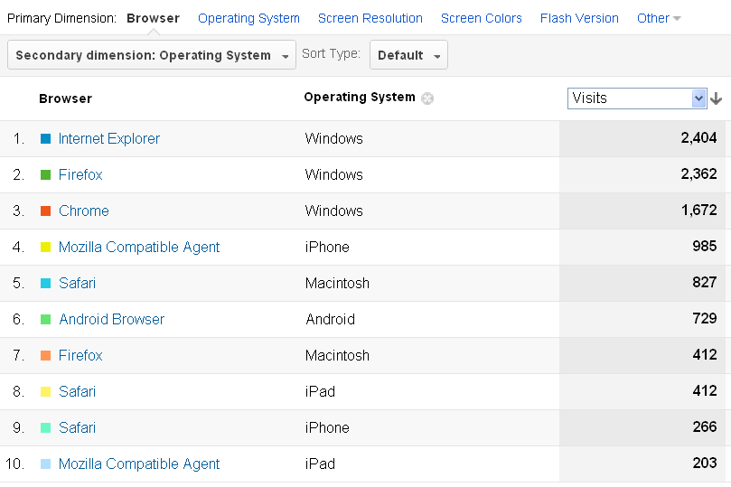
We’re going to add Operating System. Then we can see who’s on what kind of computer:
Windows is the big winner here, which comes as no surprise. We were a bit surprised by how many Android and iPhone visitors there were, indicating more people were using mobile devices to access the example site.
In addition to the Primary and Secondary Dimensions, we can add Advanced Segments from the top left menu, too, for even finer granularity.
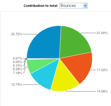
Do a higher than usual number of Chrome users on Macs abandon our site than other browsers and operating systems? Maybe we’d better get our hands on a Mac with Chrome installed and make sure the site is legible with that combination! Do lower screen resolution users abandon the site? Are mobile devices accounting for the most bounces? These are all questions the Technology report can answer!
Moving on to the Network menu, there is information about which ISP our readers are using. We ourselves are not particularly concerned about this information, but many larger corporations will find it useful. The Secondary Dimensions and Advanced Segments remain the same here.
There is also an Ecommerce link next to the Site Usage link, which can show you which types of browsers, operating systems, et cetera, your paying readers are using. Most of our customers do not run Ecommerce sites, so we’re going to skip over this in the interests of (relative) brevity. Please feel free to ask any questions you may have about the Ecommerce section, however.
This brings us to…
Social
The first item under the Social menu is Engagement. Why does this sound familiar? Oh right – because we talked about one form of engagement earlier today! However, this report shows us different information. Whereas the Audience Engagement report shows us how engaged with our site the readers are, the Social Engagement report shows us whether our readers are interacting with social media on our site; clicking our “Like us on FaceBook” or “+1 on Google+” buttons, for example.
Vexingly, for all three of our example sites, the Socially Engaged demographic was either “1” or “0.” Since we see people +1’ing and “Liking” the posts on these sites, the information seems to be… well, wrong. We’ll look into why that might be. Unhelpfully, Google offers no Social-Engagement-specific Help screens.
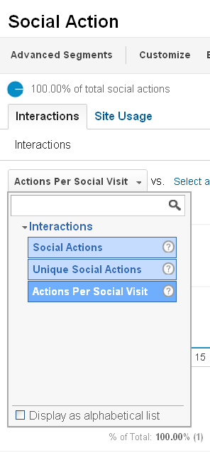
If we had interesting data to show you (ahem,) we could make use of the Action menu item, which allows us to see which social action our readers were using:
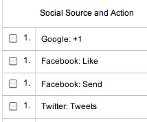
Ostensibly, the Social Actions view would show more information like this:
The list here would (in theory) include Likes, Tweets, and possibly pins on Pinterest.
Aha – here’s a screenshot of the Google Analytics Blogspot’s Social Action report:
Much more interesting! Well, kind of. If you’re into this sort of this, which we sort of are.
Of course, to have any information show up here at all, we need to have social media interaction options on our site! WordPress has a plethora of plugins designed exclusively for this purpose. There are many to chose from, and some play better with each other than others. Adding social media plugins to your WordPress site is most definitely a tutorial for a later date; for now, just know they’re out there, and that you can search for them in your plugins install area.
On the Black Chicken Host site, we block Pinterest (because of their abhorrent anti-privacy and anti-property rights policies,) but we encourage Tweets, Likes and +1’s:
The Social Pages report will help us to determine which of our pages is encouraging the most social interaction. Again, we are bereft of our own data to show you, so here’s a link to a site with more interesting stuff than we can provide you. Our humble apologies.
Mobile
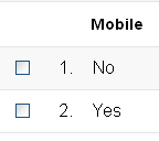 We’ve arrived at the last portion of our second installment for today – the Mobile report.
Looking at the image to the left, it looks fairly straightforward, right?
Mostly.
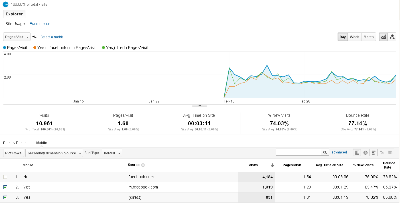
In addition to the usual dimensions and geegaws, we can also select two rows (once a Secondary Dimension is selected) and Plot Rows in the line graph from this report.
To generate the graph below, we selected Pages/Visit from the top drop-down, Mobile = Yes, a Secondary Dimension of Source, and plotted the rows fro m.facebook.com (FaceBook’s mobile site) and direct traffic:
Other interesting demographics to explore are which countries are using the most mobile devices, which sources are driving the most mobile traffic, and how many pageviews mobile readers are accumulating per visit. There are so many ways to view your website’s data, it’s nearly a full-time job!
The Devices menu shows us what type of mobile devices our readers are using.
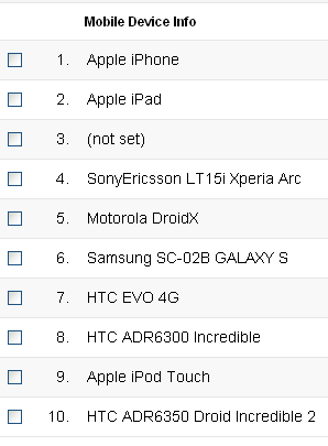
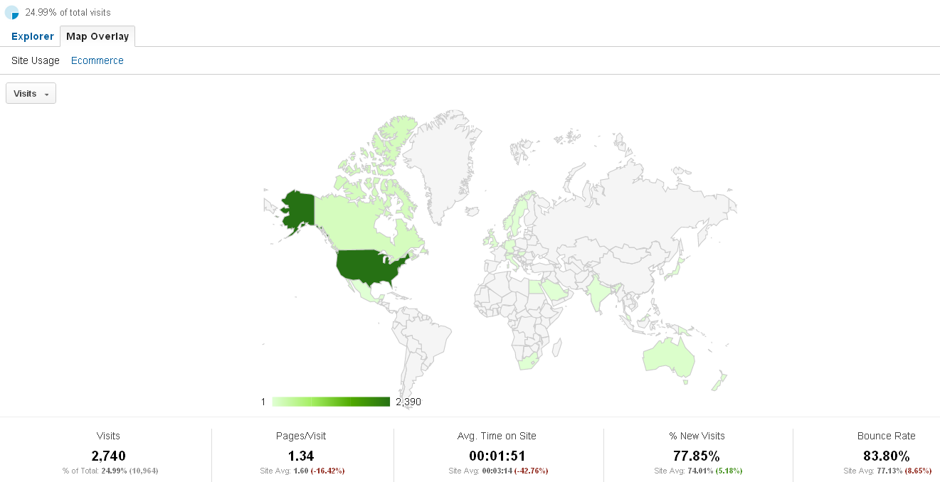
A neat feature of the Devices report is the Map Overlay, which shows the countries accessing our site with this method:
We see from this screen mobile readers account for 24.99% of our example site’s traffic, and mobile users tend to be from the United States. Other countries accessing the site via mobile devices include Australia, Egypt, England, and Sweden.
Done!
This wraps up all but the final, neat-o feature of the Audience menu. We’ve talked about how to use your Audience demographics in a variety of ways, including site design, content, and social engagement.
We have one more mini-Camp for today – Bells & Whistles & Graphs (yes, “oh my”) – which will show you how to chart the information a bit differently on some of the reports. We’ll see you there – thanks for reading!

