Analytics Boot Camp, Day 4,Part 3: Bells & Whistles & Graphs
Now is as good a time as any to point out some of the bells and whistles of select reports pages. Not all of these options are available on every report, but we’ll show you where to look.
Timeframe
In the top right corner of most line graphs, we set the timeframe for the information:
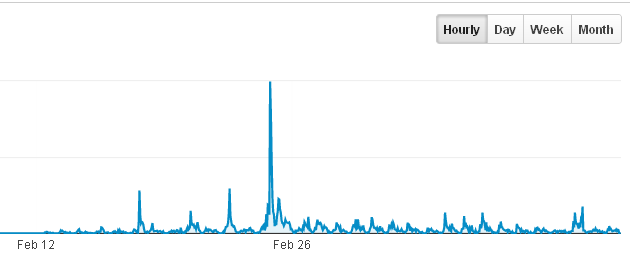
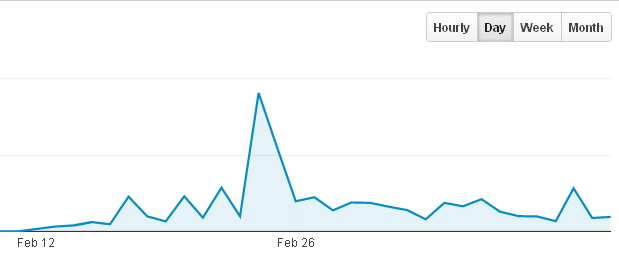
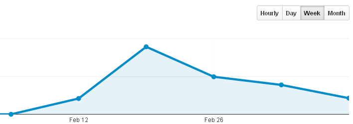
This does not change the date range, mind you, which appears in the top-most area of the report. The Hour/Day/Week/Month setting only adjusts the granularity of the information. Let’s take a look at one of our example sites. We’ll go in order:
Hourly:
Daily:
Weekly:
Monthly:

Advanced Search
On many pages, there is an advanced search option toward the center right of the page:
It will bring up a search area, which we can use (of course) for advanced search features. We may search inclusive/exclusively for report-specific dimensions containing/not containing, et cetera certain keywords:

We filled in an example search:
We may add more dimensions to refine the data further.
Graph Type
We can also choose how our data is displayed by selecting the type of graph we want to see using this little interface, which is at the right side of the screen:
![]()
From left to right, the chart types are data, percentage, performance, comparison, and pivot. What?!
Data: A straight-up, spreadsheet-like view of the information
Percentage: A pie graph
Performance: A bar graph
Comparison: Two bar graphs compared to each other (we can select the metrics used)
Pivot: We’ll be honest – we had to look this one up. It’s actually pretty handy! The “pivot” mode allows us to juxtapose two sets of data; for example, if we want to see which keywords are generating traffic to a certain landing page, we can.
Two other options sometimes show up, as well – again, on the right side of the screen:
The left icon is for the standard line graph, and the right is for a scatter plot. On the scatter plot screen, we may also switch to a bar graph.
Export/Add to Dashboard

We may export given reports to a format we may use in other programs, such as Excel or Open Office. Click Export, and select the format:
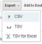
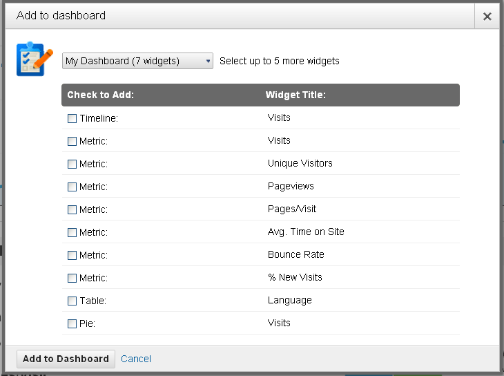
The Add to Dashboard interface allows us to add a given report to any of our dashboards for quick reference:
Back in the Real-Time tab, we forgot to mention the Google Earth option under Locations, Viewing, Earth. Google Earth views do require the Google Earth plugin, else you’ll see this:
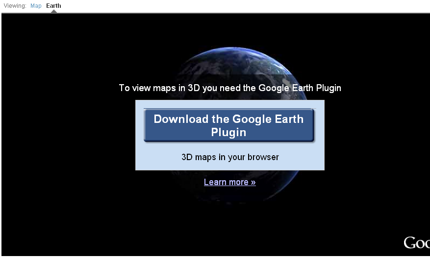
This technology continues to humble and amaze us, truly. Utilizing satellite imagery combined with 3D mapping, it’s possible to zoom into incredible views of our readers’ locations. The plugin is pretty resource-heavy, and not all computers will be able to support it. It may take some time to load, as well – but it’s soooo worth the wait.
Think about this for a moment, though – using this page, we are watching people from all over the world, in real time, browsing our site… and we can peek at their general location using photos from space. Are you kidding me? How cool is that?!
Before we get our geek all over you, we’ll call it quits for today. The two-week-old chicks are begging for some cuddle time, and they’re too hard to resist!
We’ll see you tomorrow for the marvelous Visitor Flow screen, which shows you which pages people are clicking on, in order.


