Analytics Boot Camp: Day 3 – Standard Reporting Tab, Part 1
Buon giorno, Boot Campers!
In Days One and Two of this Boot Camp, we covered signing up for Google Analytics (GA,) we went over the Home Tab in the Admin Dashboard, and covered Intelligence Events.
Today, we’re moving on to the Standard Reporting tab, which is just to the right of the Home tab:

 One important thing to remember about the Standard Reporting tab is it’s only updated once per day, right around midnight in the website’s local time zone. Thus, data will have a bit of a lag time. Since we can only see the last 30 minutes of activity under the Real-Time area, there will be about 23.5 hours of the day for which we have no data until after midnight. Alas.
Many of the terms on the Standard Reporting tab are new friends – we’ve talked about them in the previous installments of this Camp. It’s also worth noting the information displayed will be filtered by the date that’s selected in the top right-hand corner, which you may change to suit your needs.
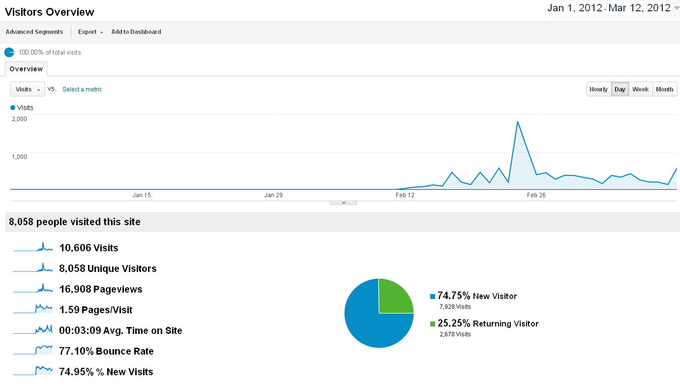
By default, we’ll see something which looks like this (click to view larger in a new tab/window: )
If you have made modifications to your Dashboard, your view may look a bit different,but it should be right along these lines.
On this main view, we can see an overview of our visitors, including a line graph of traffic, a breakdown of some important statistics list form, and a pie graph of New/Returning visitors. Scrolling down the page gives us some Demographics information, as well.
Let’s start at the top.
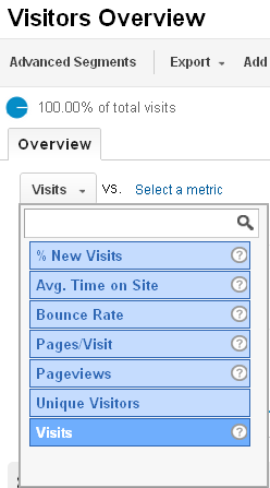
We can view one metric, or we can pick to metrics to compare by clicking on the “Visits” drop-down menu directly beneath the “Overview” tab label. This brings up a list of metrics. Selecting one here graphs out that one metric. To compare with another metric, we need to also select a second metric from the second drop-down.
First, though, let’s look at just one metric – Visits.
The line graph is self-explanatory – it just charts the number of visits over time, and it will change based on the metric we select from the drop-down menu. For our visits, we can see a few spikes and dips, which is to be expected over time as we do campaigns, giveaways, or become featured on popular sites.

If we mouse over a point on the graph, a pop-up will appear for that point in time, too, which is handy for getting snapshot information about a given spot on the line.
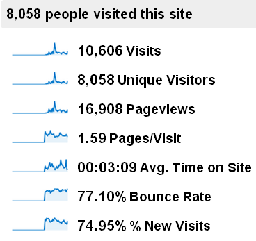 The itemized list of traffic below and to the left side of the screen gives us some nice nutshell information, and clicking on any of the miniature graphs in that list will transfer the metric to the main line graph above.
We’ve covered this terminology previously, so we won’t revisit here.
The pie graph by default shows our New Visitor/Returning Visitor information.
The demographic information at the bottom breaks down various metrics, including Country/Territory, City, Browser Type, and other information. Clicking on a demographic in the right-hand list will expand the information in a list off to the left. We can click the information on the right list to bring up an overview covering that demographic fully.
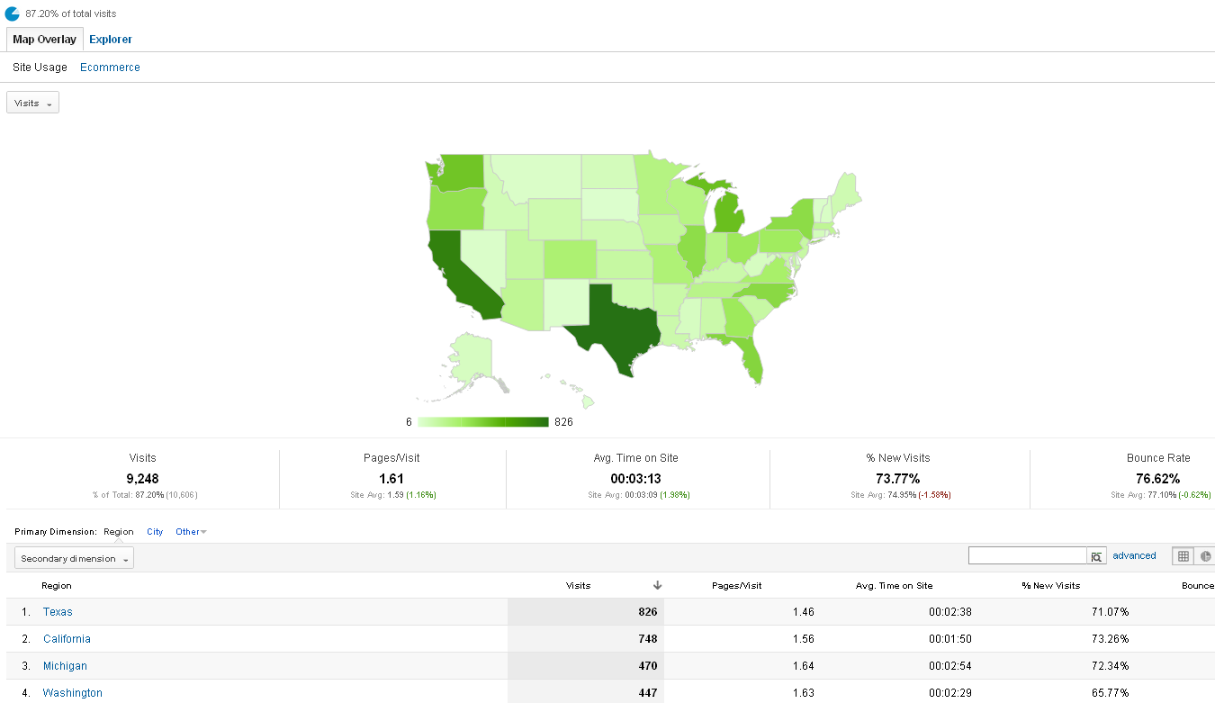
In the example below, we selected Country/Territory, then United States (click to make larger: )
There’s so much information here – we’ll just touch on the highlights.
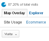
We can see by the image to the left of this text the US accounts for 87.20% of all traffic to the site. We see we’re currently looking at the Map Overlay/ Site Usage area, and that we’re looking at the Visits metric. We can select other metrics from the drop-down, and compare the relative attention spans between states (pageviews,) or the geographic locations where most of our bounce rates come from. This is a fun screen. 🙂
The Ecommerce tab will show how our various Goals are distributed by Location. Goals need not be sales – they could be newsletter signups, or free product downloads.
Switching to the Explorer view takes us to a line graph view of the Location Overview.
That takes us through the Demographics overview under Audience, so let’s go back to the main Audience Overview by clicking it on the left side. This time, we’re going to compare two metrics.
Be sure to pick metrics which will help you to understand something about your traffic and site use.
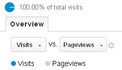
For the purposes of this example, we’re going to select Visits vs. Pageviews; this will graph data for both the visits and the pageviews. The visits data will be in darker blue, and the pageviews in a lighter blue.
We can see the two are pretty closely tied together, which makes sense:
Comparing data such as pageviews vs. bounce rate will show more disparate information. In the graph below, pageviews are darker, and the bounce rate is lighter.
Attention Span Relief
We’re working on keeping these Boot Camp sessions shorter, so that’s all for this one! We’ll have more later today.
Coming up next, we’ll look at the snazzy information we can find in the Behavior tab under Standard Reporting. Thanks for reading, and stay tuned!

